Building a Data Dashboard to Track Education Outreach Efforts
Background
Region 3 (RML) of the Network of National Library of Medicine (NNLM) serves Texas, Louisiana, Arkansas, Kansas, Nebraska, and Missouri. The RML offers outreach, funding, and education to advance the mission of NNLM by providing health professionals equal access to biomedical information and improving the public’s access to information to enable them to make informed decisions about their health. The RML created data dashboards to understand the impact of its educational outreach efforts and identify trends and areas of opportunity.
Methods
A data audit was conducted to review currently tracked data points. The audit included documenting the source, variable name, file type, and answer format of every collected data point. The data audit revealed duplicated efforts and where processes could be standardized or streamlined. RML staff discussed the results of the data audit and determined that attendance, geographic location (zip codes and states), select survey questions, event title, date, and MLA continuing education credits were most important when gauging education outreach efforts.
Next, RML staff worked together to create data dictionaries, define the selected data points, and solidify processes for capturing, recording, and analyzing that information. To communicate and share up-to-date information, the RML decided to create a data dashboard. The dashboard needed to display this information in an understandable format, be easily shareable, and be frequently updated.
The selected data points were cleaned and compiled in an Excel file and then fed into PowerBI and Tableau Public to create sample dashboards.
Comparing the Tools
PowerBI and Tableau Public both have options to upload various file formats. Both tools were easily shareable, but in different ways. PowerBI, a Microsoft product, can be embedded into Teams. Tableau Public can be embedded in websites, shared on Confluence, downloaded, or shared as a link. Once the visualizations are created and formatted, both tools can be frequently updated by refreshing the data source. While both tools have steep learning curves, numerous help resources are available.
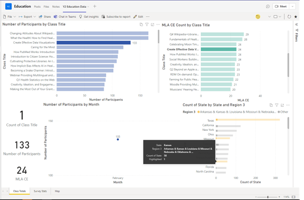
The tools also allow users to interact with the data through filters and connect information across visuals. Example 1 shows how a PowerBI user can select one class (Create Effective Data Visualizations), and the other information becomes faded. Similar features are available in Tableau Public.
Example 1

Tableau Public
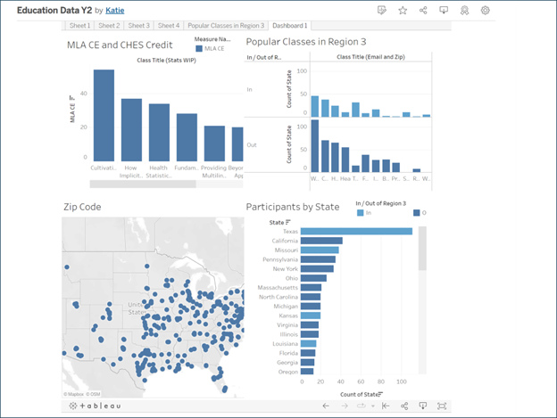
Tableau Public connects with Redcap to make transferring survey data easier and faster. Tableau Public also has more options for showcasing date/time information. Tableau has an established date hierarchy, recognizing that August 2022 is chronologically January 2023. Tableau Public is free, but the more advanced features are behind a paywall.
One significant benefit of Tableau is its geolocation and map visualization. Tableau bases its maps on Google Maps. It automatically converts zip codes to latitude and longitude to accurately map data points.
Tableau Public Dashboard

PowerBI
PowerBI allows for minor edits and formatting changes. It offers advanced analytics and extensive tutorials, guides, and help forums. One obstacle with PowerBI is its limitations with location data. PowerBI uses Bing Maps and other third parties for geolocation data. It does not automatically convert zip codes to latitude and longitude. PowerBI cannot create accurate maps using zip codes alone. Another drawback is date data. Users must manually set up date hierarchies. PowerBI will order by month (January 2023, August 2022, June 2023) rather than year and month (August 2022, January 2023, June 2023).
PowerBI Dashboard Participant Numbers

PowerBI Dashboard Survey Results

Conclusion
Both tools adequately met the RML’s needs. The RML heavily relies on Teams for document storage and communication, and PowerBI is embeddable in Teams, so it was chosen as the final dashboard model. The PowerBI dashboard allowed the RML to compare attendance across states and identify highly attended and popular classes. The RML reached over 3,000 participants this fiscal year, with most participants hailing from Texas, California, New York, Ohio, and Missouri (consecutively). Survey results show that the most popular classes were “How PubMed Works” and “Beyond an Apple a Day: Providing Consumer Health Information at Your Library.” The RML continues to use the PowerBI dashboard to track education programs and uses the information to make more strategic decisions about class offerings and outreach.

